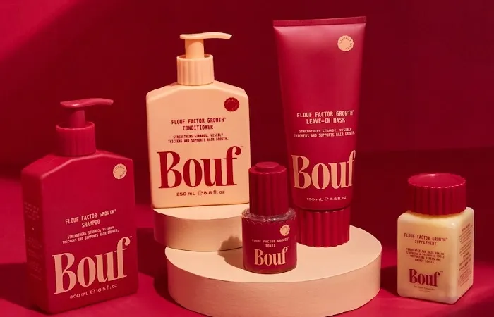
Melbourne-based creative agency Willow & Blake has teamed up with Gen Z beauty entrepreneur and CMO Rachael Wilde, along with York St Brands (YSB), to develop the identity of Bouf—a new haircare brand that uses patented FGF5 protein technology to combat hair loss.
Bouf joins the YSB family alongside established brands tbh. Skincare and BOOST LAB. The products are available exclusively at Priceline and Atomica in Australia, and Farmers in New Zealand.
A New Launch With Expert Support
Launching Bouf marked a different journey for Wilde. She recalls, “With tbh. Skincare, it was just me and my mum figuring it out. With Bouf, we had experts guiding us through the process.”
Wilde praises Willow & Blake’s approach: “They understand that a brand has to make you feel something. They gave Bouf a distinct personality and really brought it to life.”
A Name and Brand Full of Energy
The name Bouf, inspired by onomatopoeia, symbolizes the volume and energy the brand promises. It’s punchy, fun, and easy to remember. This energetic name set the tone for a playful, self-aware, and slightly chaotic brand identity.
“People want transparency,” Wilde explains. “Involving them builds trust and makes them feel part of the journey.”
Targeting Moms with Style and Wit
Bouf’s primary audience is moms facing postpartum hair loss—a common yet often overlooked issue. Unlike many competitors who come across as cold or outdated, Willow & Blake focused on design-led branding and voice-heavy copy to connect warmly and authentically.
Rather than treating moms like babies, Bouf embraces them with wit, warmth, and style, affectionately calling its community “Bouf heads.”
Packaging and Product Names Reflect Personality
The product names and packaging copy, like “Flouf Factor” and “Va Va Voom,” embody Bouf’s bold and expressive personality. The brand aims to delight customers even before they open the bottle.
Visually, Bouf stands out with its bold, feminine crimson color and a custom ribbed packaging design. This design creates a tactile and visually striking presence both on shelves and online.
“Every detail had to reflect the product promise,” says Bri Nixon, Creative Director at Willow & Blake.
“The ribbed pattern mimics thick hair, and the curves represent elasticity. We wanted to create an emotional connection before you even touch the product.”
Related Topics
- JAK Inhibitor Discontinuation Triggers Hair Loss In Severe Alopecia Areata
- Kanpur: Female Dentist Surrenders Over Hair Transplant Deaths
- Indy Clinton Shares Her Beauty And Hair Secrets


